customer survey - parents
discovery & research
Over the first phase of the project, I focused on understanding Harmony at both the business and user level before making major technical decisions. Parent surveys were a primary input, analyzing recent feedback to understand where frustration was coming from and whether it reflected service quality or the platform experience.
"I struggled to use the website and find everything on it. But my mentor and customer support have been amazing at helping me figure it all out."
approximate feedback breakdown
- total parent responses: 204
- percentage expressing frustration: ~25%
- clearly negative and frustrated: ~8%
- % frustration is website related: ~75%
Top parent complaints:
- website usability
- login/setup issues
- navigation confusion
- enrollment/onboarding friction
- communication/workflow breakdowns tied to the platform
The largest customer pain points were UX and platform related, not service related.
existing website audit
discovery & research
I analyzed the existing platform from both a user experience and operational perspective to identify friction points. I reviewed the site architecture, navigation systems, onboarding flows, dashboards, and core user journeys across both public-facing and authenticated areas of the platform. This included mapping workflows for parents and employees, identifying usability issues, evaluating visual hierarchy and information organization, reviewing customer feedback and support pain points, and documenting areas where the system structure no longer aligned with user needs. The audit also included evaluating technical limitations of the existing WordPress-based framework, assessing performance and maintainability concerns.
marketing website (public)

mapping and Evaluating the public marketing pages, the website appears to have evolved over many years without a unified product or UX strategy. The platform suffers from unclear company identity, inconsistent navigation and content structure, outdated visual design, and fragmented user experiences, resulting in significant missed opportunities for marketing, trust-building, and user engagement.
1. Unclear Identity & Messaging
- It is difficult for new users to quickly understand what Harmony actually is.
- Messaging blends homeschool, online school, public education partnerships, funding programs, and curriculum support without clear distinction.
- Value proposition is not communicated simply or immediately.
2. Fragmented Platform Structure
- The experience feels split across multiple disconnected systems.
- Marketing pages, dashboards, resource centers, Canvas, registration systems, and school-specific content all operate separately.
- Navigation reflects internal operations rather than user mental models.
3. Overly Complex Onboarding
- Registration and onboarding contain too many steps, terms, portals, and explanations.
- Parents are required to understand internal processes very early.
- Workflows are difficult to follow without mentor assistance.
4. Weak Information Architecture
- Navigation structure is difficult to scan and prioritize.
- Important actions are buried within long menus and nested links.
- Content organization lacks clear hierarchy and progression.
5. Poor Visual Hierarchy
- Important actions and content do not visually stand out.
- Large blocks of text reduce readability.
- Typography, spacing, and section organization feel inconsistent and dated.
- Users must work too hard to find important information.
6. Operational Complexity Exposed to Users
- Users are exposed to internal administrative structures, educational terminology, compliance systems, and workflow rules.
- Complexity is placed on the parent instead of being simplified through the interface.
- The platform often feels process-driven rather than user-driven.
7. Weak Marketing & Conversion Flow
- Public pages do not strongly guide prospective families toward a clear next step.
- Limited emotional storytelling despite strong real-world family outcomes.
- Marketing content explains systems more than benefits.
- Calls-to-action are weak and inconsistent.
8. Lack of Audience Segmentation
- Multiple audiences are mixed together:
- prospective parents
- current parents
- schools
- vendors
- employees
- The site does not quickly direct each audience into tailored experiences.
9. Inconsistent Design System
- Pages vary significantly in layout, structure, spacing, and presentation.
- Different areas of the platform feel disconnected visually.
- The site lacks a cohesive modern UI system.
10. Limited Trust & Credibility Presentation
- Strong testimonials, success stories, and measurable outcomes are underutilized.
- The emotional impact of the program is not clearly showcased.
- The platform undersells its actual value and customer satisfaction.
clearly navigation is a problem

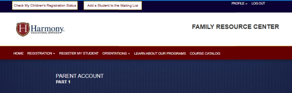

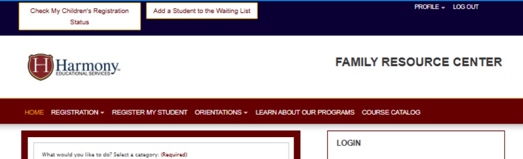
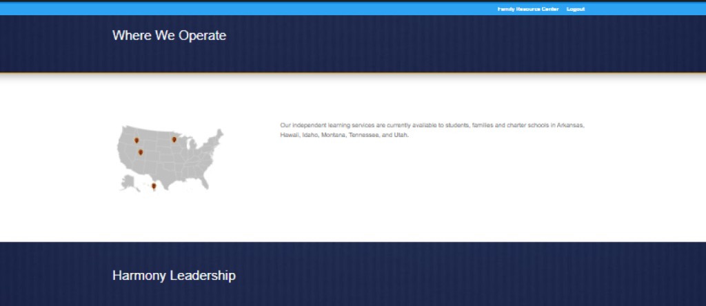

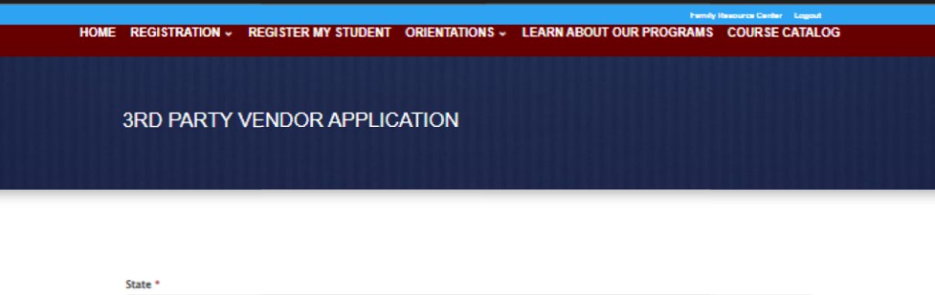
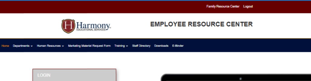
the current issues make successful marketing difficult especially for new/unfamiliar traffic
family dashboard

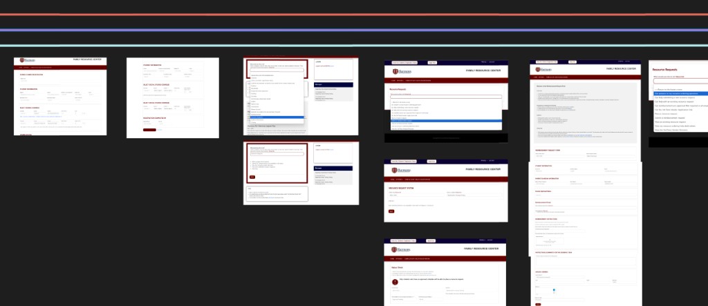
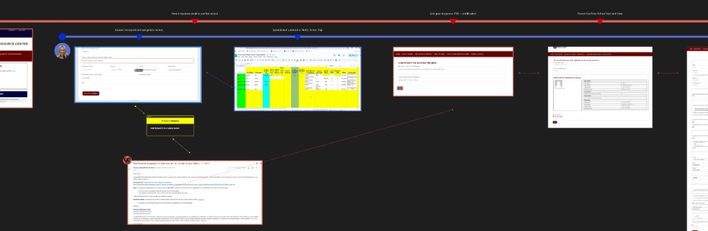
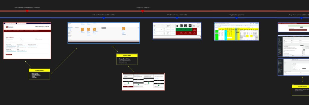
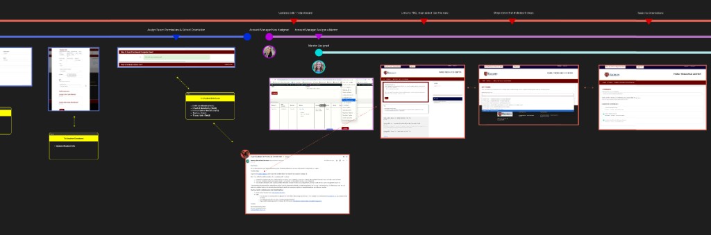
mapping the family dashboard I walked through the typical student registration journey. many pages appear unessisary to the user's journey. similar issues exist with the navigation and structure. parent complaints now make sense that express that they needed outside help from a mentor in order to navigate the system. The family dashboard appears to be a complex system with multiple steps and requirements for onboarding a student. The current flow is fragmented and difficult to follow, with users having to navigate multiple screens and forms to complete the process. The system also appears to be overloaded with data and information, making it difficult for users to find what they need.
employee dashboard
The employee dashboard contained a large number of operational tools and administrative workflows, but the overall experience lacked clear organization and usability. Important actions, approvals, communication tools, and student management systems were spread across multiple disconnected areas, creating inefficiencies and increasing training complexity for staff. Navigation and workflow structures appeared to reflect internal operational growth over time rather than a unified UX strategy, resulting in duplicated processes, inconsistent interfaces, and difficulty quickly locating or completing common tasks. Key opportunities included consolidating workflows, simplifying navigation, improving data organization, and creating a more intuitive system designed around employee responsibilities and daily use patterns.
company interviews
discovery & research
I conducted interviews and Q&A sessions with all essential staff and employees across multiple departments and operational roles to better understand internal workflows, frustrations, and day-to-day responsibilities within the organization.
Key findings:
- their parents experienced significant friction with the website especially throughout enrollment
- significant time was being spent on helping parents with the website
- employee operations relied heavily on manual processes
- many of the important list pages take several minutes to load
- important functions would sometimes not work and critical errors were happening regularly
- data was not trusted and all employees reported relying on spreadsheets
- several employees reported their frustration was so great they were considering leaving.
website problems were incurring significant employee labor costs
strategy & prototyping
While research remained an ongoing process as I continued learning the organization, I had reached a point where I could begin architecting the new platform, workflows, and visual direction. This next phase focused on aligning many needed improvements while guiding the team through significant change in a way that built confidence, trust, and shared ownership. As a newer member of the team, I recognized the importance of listening carefully, respecting existing knowledge, and helping give structure and momentum to concerns the team already understood internally. Constant collaboration, empathy, and making employees feel heard became critical parts of the process.
One of the most valuable tools throughout this phase was rapid prototyping in Figma. Using interactive prototypes, I was able to quickly transform ideas into tangible visuals and workflows that the team could react to, refine, and improve together. This allowed us to move quickly through iterations, reduce uncertainty, and make major progress in a collaborative environment built on transparency, respect, and continuous feedback.
brand and marketing
strategy & prototyping
for the marketing pages we focused on redefining Harmony’s public identity and restructuring the marketing experience around the needs of new families. we identified that the public website needed to primarily serve prospective parents first, while still supporting schools and existing families secondarily. Rather than dividing messaging between multiple audiences, the new approach focused on clearly communicating Harmony’s unique “school-at-home” model in a simple, emotionally engaging, and easy-to-understand way.
we redesigned the marketing experience to improve storytelling, onboarding clarity, trust, and conversion flow. A major focus was helping families better understand who Harmony serves, how the program differs from traditional homeschool and public school models, and what expectations and benefits come with the program. The new platform also established a stronger foundation for long-term SEO, social media marketing, content growth, and future scalability.
new theme & style-guide
While I made an effort to modernize and elevate Harmony’s visual identity, I also respected senior management’s desire to maintain familiarity with the existing brand. We ultimately compromised by refreshing and brightening the color palette, vectorizing the logo, and leveraging a simpler modern WordPress solution rather than pursuing a deeper rebrand at this time. the end result is still much cleaner and well positioned to satify our marketing goals.
old logo
new logo

new domain: harmony.education
we felt that harmony ed was not as clear and may have a connotation we didn't want to associate with. we now focus on either 'harmony' or 'harmony educational services'.
above the fold
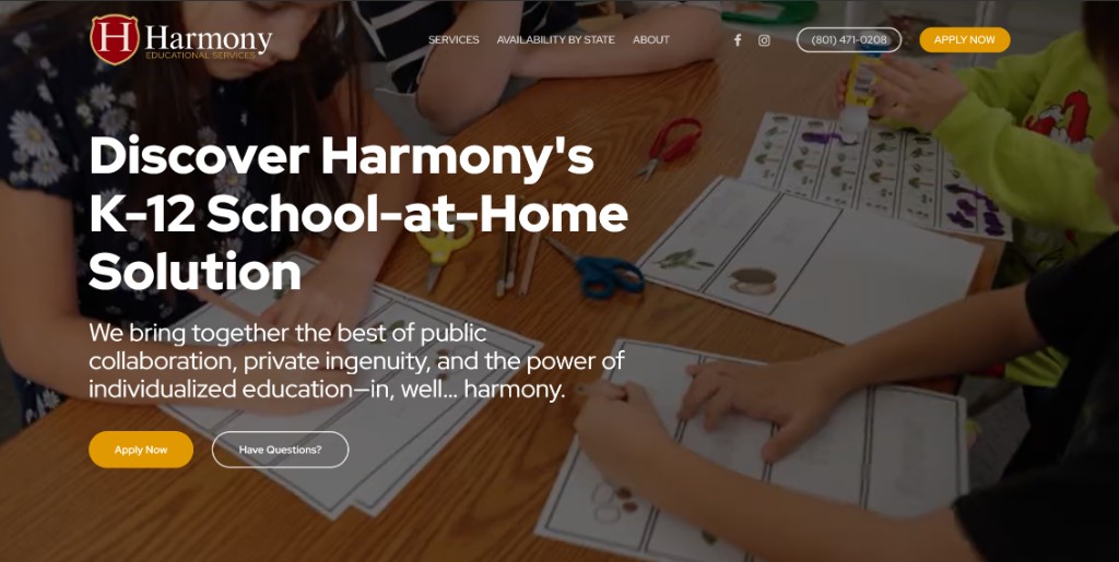
our focus here is to tell stories. currently a video plays in the background showing children in the program in a number of learning activities. we eventually plan to replace this with more direct success testimonial videos for even better emotional engagement.
We now position our identity more clearly in the primary heading and subheading. strong primary and secondary CTA.
identifying with our audience
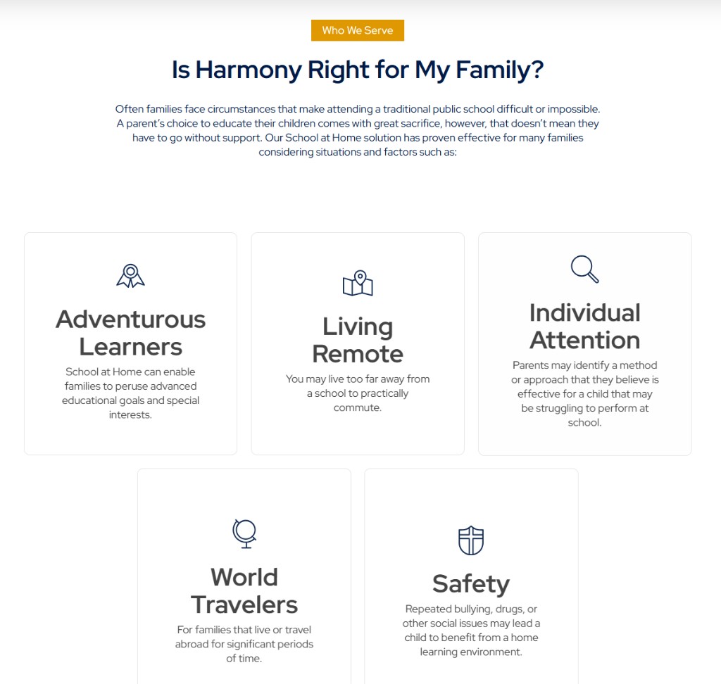
clearifying our service and identity
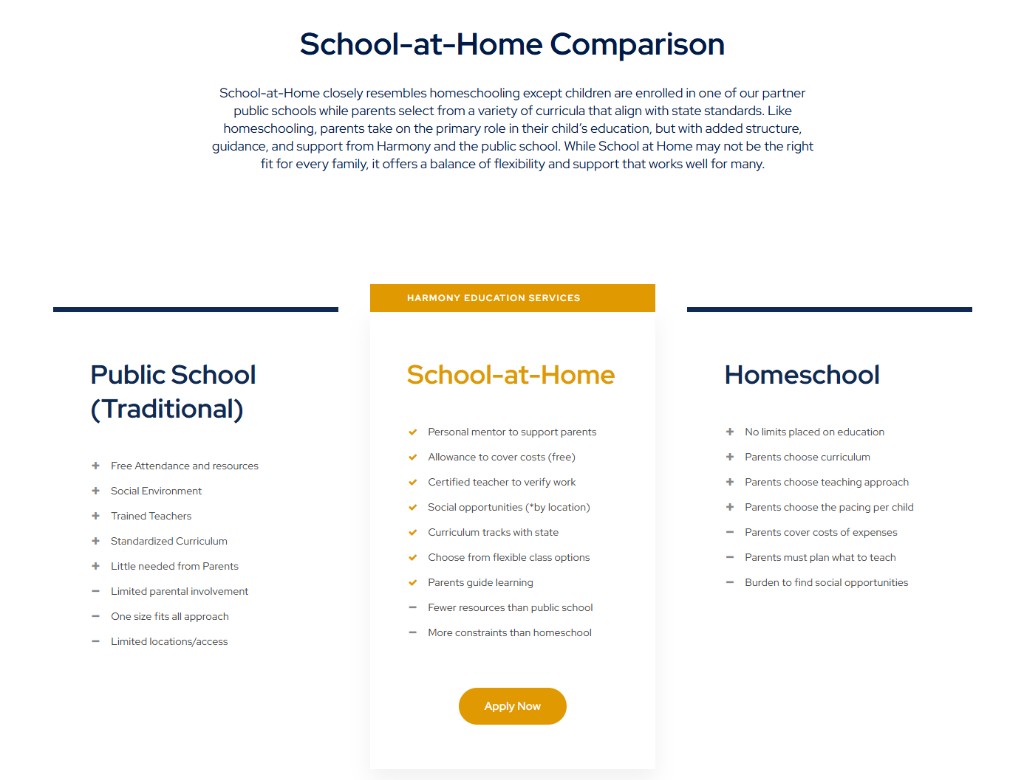
a winning strategy
- parents know who we are and have a clear path to convert
- website content and hierarchy now aligns to new prospective families
- simplified explanation of the program and enrollment process
- stronger emotional storytelling and family-focused messaging
- improved trust, clarity, and onboarding expectations
- website now informs better reducing load on staff to answer basic questions
- more modern and visually engaging design
- opens a door to SEO and social media marketing
- more scalable and maintainable WordPress architecture
family enrollment journey
strategy & prototyping
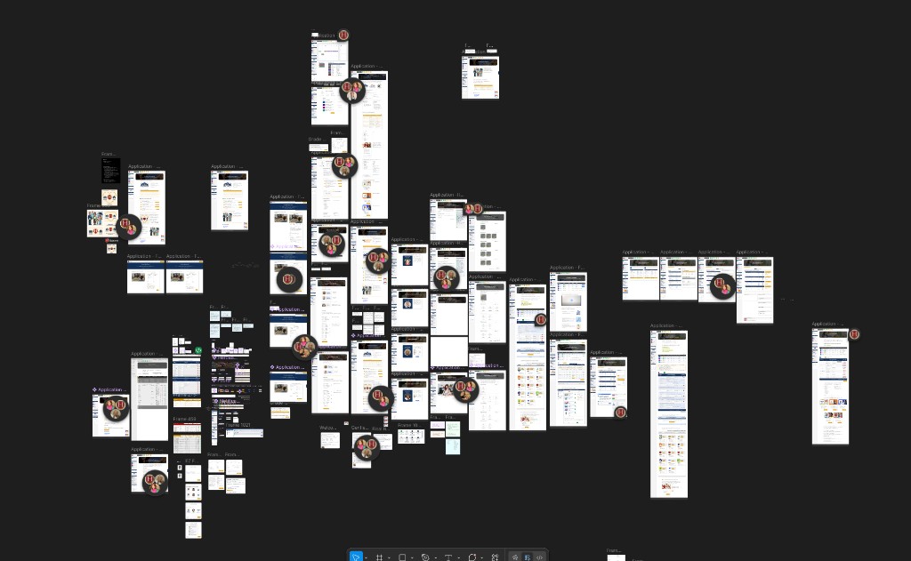
For the parent enrollment journey and new family dashboard, we focused heavily on redesigning the experience around what families actually need to successfully complete enrollment. Essential requirements, forms, communication, and onboarding tasks were reorganized into simpler grouped steps that felt clearer and less overwhelming for parents. Research showed that many prospective families struggled to understand what Harmony was, how the program worked, and what steps were required to get started. The new prototypes reflected a much cleaner and more intuitive path toward stress-free enrollment completion.
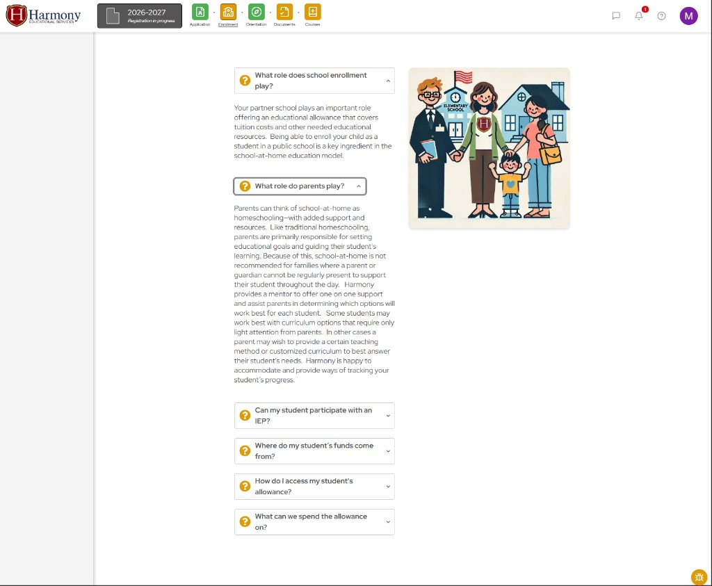
Using rapid prototyping in Figma, we mapped and rebuilt the onboarding journey around the expectations and concerns of new families. Where helpful, we reinforced the “school-at-home” concept and integrated common parent questions and explanations directly into the experience. We also removed many distracting or unnecessary elements that had previously appeared universally, reorganizing content more intelligently by state, school, grade level, and program type.
A major focus of the redesign was reducing cognitive overload and creating a clearer path toward conversion. Navigation, page hierarchy, calls-to-action, and content structure were reorganized to guide users naturally from discovery into enrollment and eventually into the new family dashboard experience. Interactive prototypes allowed the team to rapidly test ideas, collaborate across departments, and refine workflows before implementation. The result was a much clearer and more unified onboarding experience that improved parent understanding, trust, and confidence throughout the process, while also helping establish a stronger foundation for rethinking the employee dashboard and internal workflows later in the project.
effective global navigation and context
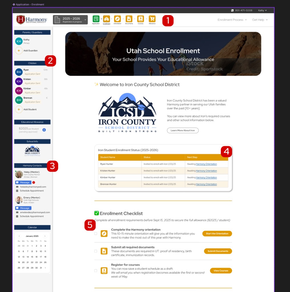
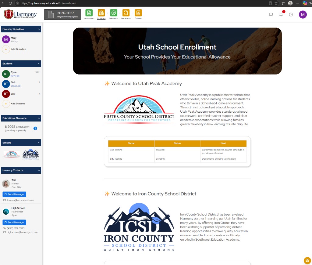
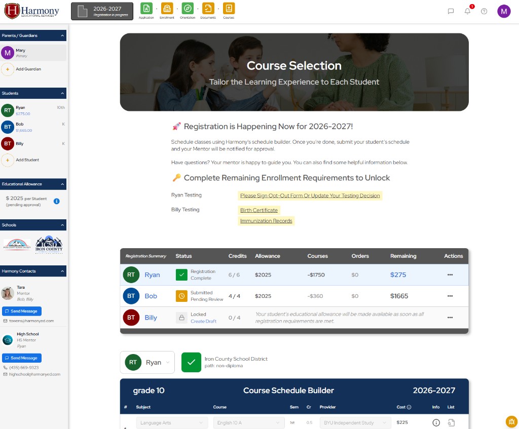
the enrollment process was redesigned into a clear step-by-step journey that guides families from application to receiving student allowance. what was previously spread across more than 60 pages was consolidated into 6 simple and easy-to-find sections: application, enrollment, orientation, document uploads, course selection, and allowance spending. colored progress indicators help families quickly understand what has been completed and what still requires attention.
a fixed sidebar allows parents to easily view and switch between all enrolled family members throughout the experience. each listed parent and student links directly to editable profile and enrollment pages, reducing navigation friction and improving accessibility across the platform.
harmony mentors are a core part of the family experience. the platform now provides direct visibility into each family’s assigned mentor along with integrated messaging access, making communication simple, immediate, and consistently accessible throughout the school year.
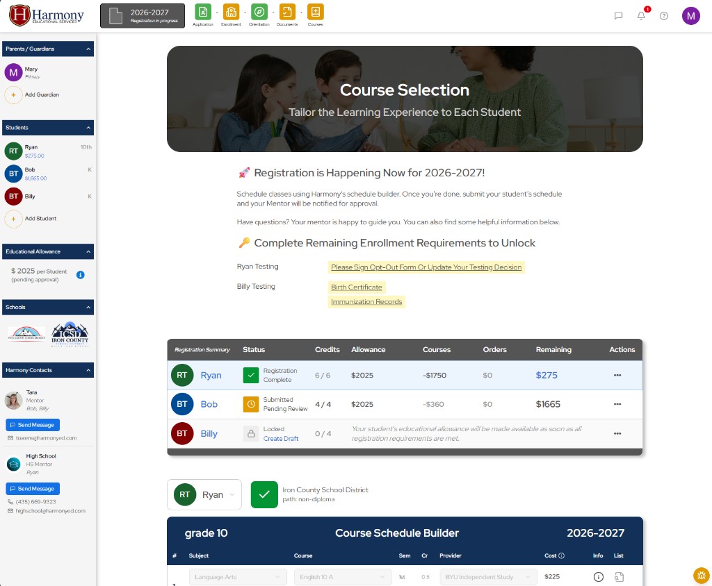
a centralized status table provides parents with a quick overview of each student’s enrollment progress, current standing, and required next steps. this creates greater transparency while helping families stay organized and informed throughout the enrollment process.
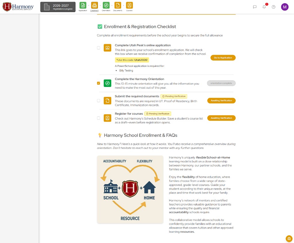
the checklist system aligns directly with the platform’s primary navigation, reinforcing the user journey while providing additional guidance and context at each stage. this approach reduces confusion, improves completion rates, and helps families confidently progress through complex workflows.
employee workspace
strategy & prototyping
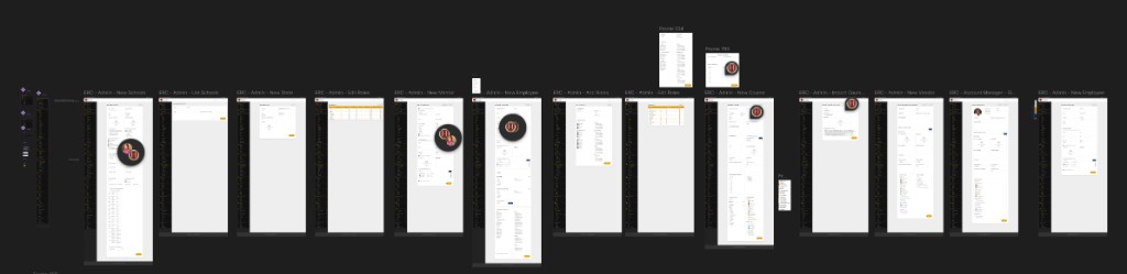
the employee dashboard redesign focused heavily on reducing operational friction within a highly complex educational environment. employees previously relied on fragmented systems, unclear workflows, and repetitive manual processes that slowed operations and increased confusion. interviews revealed that employees were effectively acting as human middleware, guiding parents through a broken system while simultaneously managing their own disconnected tools and workflows. i began by mapping operational dependencies, employee responsibilities, approval chains, and recurring friction points to better understand the realities of daily operations.
a major focus of the redesign was consolidating disconnected tools into a more unified and intuitive operational platform. dashboard layouts, information hierarchy, user roles and privileges, role-specific dashboards and actions, and navigation systems were reorganized around the real priorities and behaviors of employees rather than the limitations of legacy systems. i prototyped a workspace organized around roles and daily tasks, consolidating approvals, communication, reimbursements, and student management into a more coherent internal experience. complex operational workflows were simplified into clearer and more guided systems that reduced unnecessary navigation, repetitive work, and cognitive overload.
special attention was given to surfacing the most important actions, statuses, approvals, and workflows in clear and accessible ways. through rapid prototyping and iterative testing in figma, workflows could be explored, refined, and validated before implementation. this process allowed operational concerns, employee feedback, and organizational goals to shape the system architecture early in development, resulting in a more scalable, maintainable, and human-centered operational platform.
another major focus of the redesign involved improving the quality, structure, and usability of organizational data. in previous years, data was often inconsistent, fragmented, and difficult to trust, limiting its usefulness for operational planning, financial oversight, and strategic decision-making. reporting systems lacked clarity, and important trends related to student retention, enrollment behavior, finances, and organizational performance were difficult to identify or act upon.
the redesigned systems were built with a much stronger emphasis on structured and actionable data. workflows, database relationships, and dashboard experiences were reorganized to create cleaner and more reliable information throughout the platform. the goal was not only to improve day-to-day operations, but to give management and marketing teams far greater visibility into user behavior, retention, financial trends, and organizational performance. by creating more consistent and accessible data systems, the platform introduced a new level of clarity and operational control that better supports long-term growth and decision-making.
effective global navigation and context
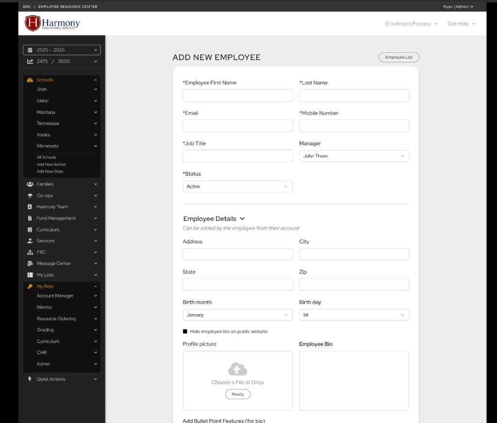
i designed a number of key operational pages around a consistent system of reusable tables, forms, and workflow patterns. these interfaces were organized through a global navigation structure that grouped related operational areas together in a more intuitive and scalable way. employee access throughout the platform is permission-based, allowing users to view only the global systems and tools relevant to their responsibilities and role within the organization.
a major part of the redesign involved introducing a dedicated “my role” navigation where employees can directly access the dashboards and workflows most relevant to their daily responsibilities. these role-based dashboards became the primary workspace for employees, allowing operational tasks, approvals, communication, reimbursements, and student management to be cleanly organized within role-specific environments. this structure reduced confusion, improved efficiency, and created a far more focused and maintainable operational experience across the organization.
structuring and presenting data
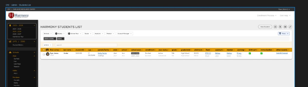
at this stage, i began taking a deeper look at the data the organization had collected over previous years and exploring how it could be better structured, organized, and presented across a variety of operational views. i started mapping relationships between families, students, school years, curriculum, courses, vendors, mentors, and users while making detailed plans for how the new tables and interfaces would function. this early systems planning led to a number of important optimizations later in development, helping transform previously fragmented information into clearer, more actionable operational data.
tech stack
system architecture
i evaluated stack options against performance, security, data integrity, scalability, and the team’s ability to realistically maintain and extend the platform over time. because the rebuild represented a long-term investment into the future of the company, technology decisions were approached with careful consideration rather than short-term convenience. i spent significant time researching modern development ecosystems, studying production architectures, watching technical discussions and expert debates, and comparing how different stacks aligned with both our current operational requirements and the company’s projected future needs.
beyond technical capability alone, i also considered ecosystem maturity, long-term community support, developer experience, maintainability, hiring potential, and the projected longevity of each technology. particular attention was given to selecting tools with strong momentum, healthy communities, and architectures that aligned well with scalable operational systems. the resulting stack was chosen not simply because it was modern, but because it represented the strongest balance between performance, reliability, maintainability, flexibility, and long-term sustainability for the organization.
moving to a fully typescript-based environment was a foundational decision intended to address many of the data inconsistencies and reliability issues present in the previous system. with many interconnected workflows, operational systems, and database relationships, static typing introduced significantly stronger reliability and maintainability across the growing codebase. typescript helped reduce runtime errors, improve development confidence, enforce cleaner data structures, and make large-scale refactoring far safer and more manageable over time.
react provided a flexible and component-driven foundation for building highly interactive dashboards and reusable interface systems. the project required a large number of dynamic tables, forms, workflows, and role-based experiences that benefited from react’s modular architecture and efficient state-driven rendering. reusable component patterns also helped improve consistency and long-term maintainability throughout the platform.
next.js was selected in large part to support a major organizational priority: improving loading speed and performance while maintaining the flexibility and power required by a highly dynamic operational platform. next.js provided a scalable full-stack framework capable of supporting both frontend and backend functionality within a unified development environment. its routing system, server-side rendering capabilities, api support, and optimization features made it particularly well-suited for a platform containing both public-facing experiences and highly interactive authenticated dashboards.
postgresql was chosen as the primary database because of its reliability, scalability, and ability to manage highly relational operational data. the platform required complex relationships between families, students, schools, mentors, reimbursements, approvals, communication systems, permissions, and financial workflows. postgresql provided a strong foundation for structured, long-term data integrity while supporting the increasingly sophisticated reporting and operational systems planned for the future.
drizzle orm was selected for its lightweight architecture, strong typescript integration, and close alignment with native sql structure. unlike heavier abstractions, drizzle allowed greater transparency and direct control over database design while still providing the safety and developer experience benefits of a modern orm. this balance was especially valuable for building and maintaining complex operational workflows where performance, maintainability, and data clarity were all critical priorities.
auth.js provided a flexible and secure authentication system capable of supporting role-based access, session management, and protected operational workflows. because the platform contains highly sensitive student, family, financial, and employee information, authentication and permissions architecture became a critical consideration from the earliest stages of development. auth.js allowed the platform to support highly customized access control across many different employee roles and user types.
vercel was chosen for deployment and hosting because of its seamless integration with next.js, simplified deployment workflows, scalability, and strong developer experience. rapid deployment previews and streamlined infrastructure management allowed development and iteration to move significantly faster throughout the project lifecycle. after evaluating the platform’s scale and operational needs, vercel also appeared to be a strong financial decision, as its pricing structure tends to be particularly cost-effective for small to mid-sized organizations while still supporting modern performance and deployment requirements.
this stack later proved to be an excellent choice for modern ai-assisted development
data structure
system architecture
The new platform architecture focused heavily on creating a scalable relational data structure capable of supporting the growing complexity of Harmony’s operations while addressing fragmentation across the system. The redesigned architecture centralized relationships between families, students, school years, schools, employees, courses, approvals, communications, and enrollment workflows into a more unified and maintainable platform.
A major focus of the redesign was building reusable and flexible structures that could effectively support multiple states, schools, grade levels, funding models, and operational requirements. The system architecture was designed to better reflect real-world organizational relationships while remaining adaptable for future growth, evolving workflows, and long-term business needs.
overcoming previous limitations:
| problem | solution |
|---|---|
| Student data previously lacked proper school-year organization and historical tracking. | The new system introduces dedicated studentSchoolYear and familySchoolYear structures to preserve year-by-year enrollment history, including schools, mentors, courses, grades, and enrollment status. |
| Students and guardians were previously poorly grouped and difficult to manage together. | The new architecture introduces a centralized family structure that allows multiple students and guardians to be connected within a single family account for clearer organization and easier management. |
| Large-scale data relationships and reporting were previously inefficient and difficult to query. | The new relational PostgreSQL architecture allows for more precise SQL queries, intelligent joins, and significantly more efficient data retrieval and reporting. |
| Curriculum management previously required duplication across schools, creating maintenance problems. | The new system separates reusable curriculum data from school-specific curriculum relationships using dedicated curriculum and schoolCurriculum structures, greatly improving maintainability and consistency. |
| Many operational workflows and records were previously untracked or managed manually through spreadsheets. | The redesigned system introduces many new relational tables and workflow tracking systems, allowing operational data to be managed more securely, consistently, and centrally from a single source of truth. |
key data relationships:
the new database architecture supports over 120 tables and relationships, including:
- family accounts
- guardians
Supports grouping parents, students, addresses, orientation, preferences, and family-level records together.
- students
- student school years
- family school years
Creates a clean separation between permanent student data and year-by-year enrollment history.
- states
- schools
- school years
- state school years
- school school years
Supports multiple states, schools, yearly rules, funding models, dates, caps, and school-specific settings.
- student school years
- holds
- automatic placement waitlists
- automatic placement warnings
- withdrawing students
Tracks enrollment status, placement, registration progress, holds, withdrawals, and workflow state.
- harmony employees
- roles
- employee roles
Supports employees having multiple roles, assignments, permissions, and responsibilities over time.
- student course lists
- student course list items
- student course list history
- course grades
- student course grades
Supports course selection, registration, grading, history, and auditability.
- document types
- student documents
- required school documents
- testing exemption forms
- testing exemption students
Tracks required uploads, approvals, signatures, testing forms, and document verification.
- family account notifications
- email events
- email unsubscribes
- marketing email contacts
Supports system notifications, email tracking, preferences, and marketing communication.
- family accounts
- lead sources
- source categories
- certified harmony representatives
- active referral years
Tracks how families find Harmony and supports referral and marketing attribution.
- media library
- images
Supports reusable media, uploads, private/public assets, and content organization.
family dashboard - serving parents
iterative ux development
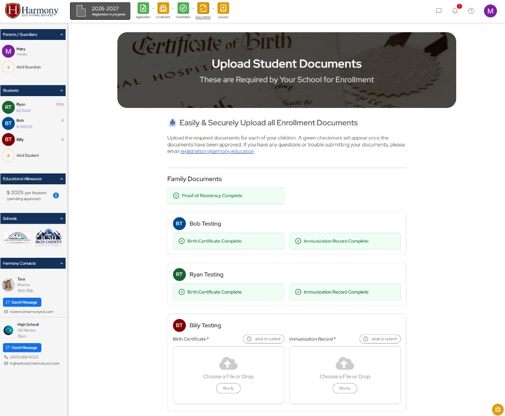
The completed platform now provides families with a much clearer path from discovery to enrollment and ongoing participation within the program. Parents can more easily manage student registration, onboarding, document submission, course selection, orientation, reimbursements, communication, and school-year workflows from a centralized dashboard experience. The new architecture also better supports multiple schools, states, grade levels, and operational requirements while reducing many of the inefficiencies and frustrations that previously required manual staff intervention.
Today, the platform serves families through a significantly more organized, modern, and scalable experience that better reflects the value of Harmony’s educational model. The redesigned system improves usability, communication, workflow clarity, and long-term maintainability while creating a stronger foundation for future growth, automation, analytics, and AI-assisted operational improvements.
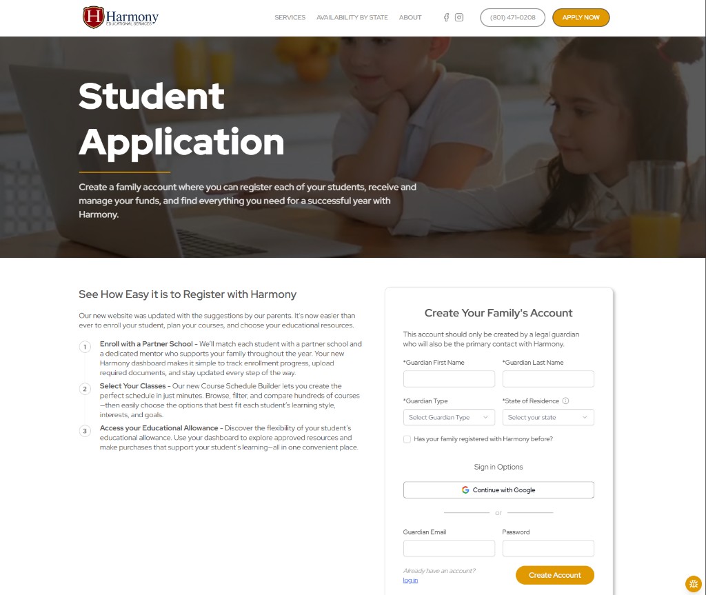
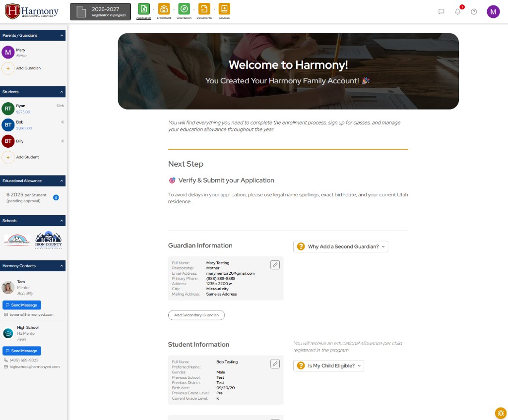
featured improvements:
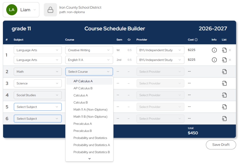
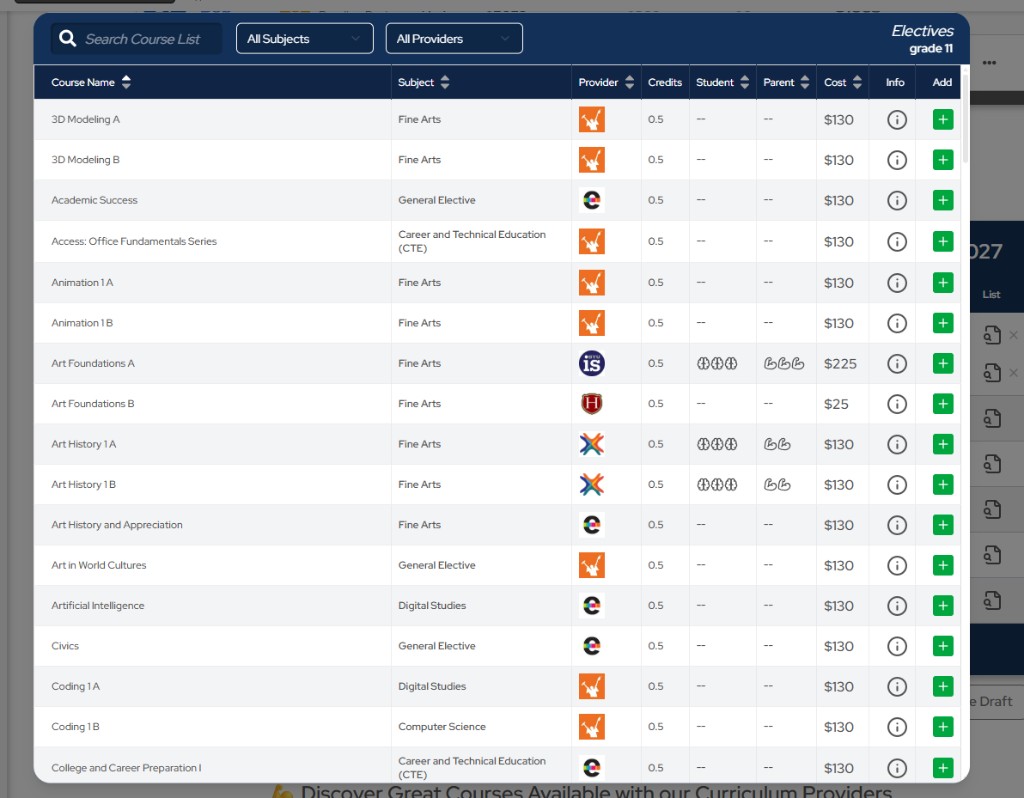
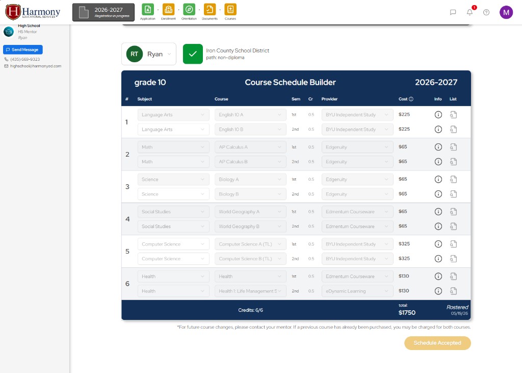
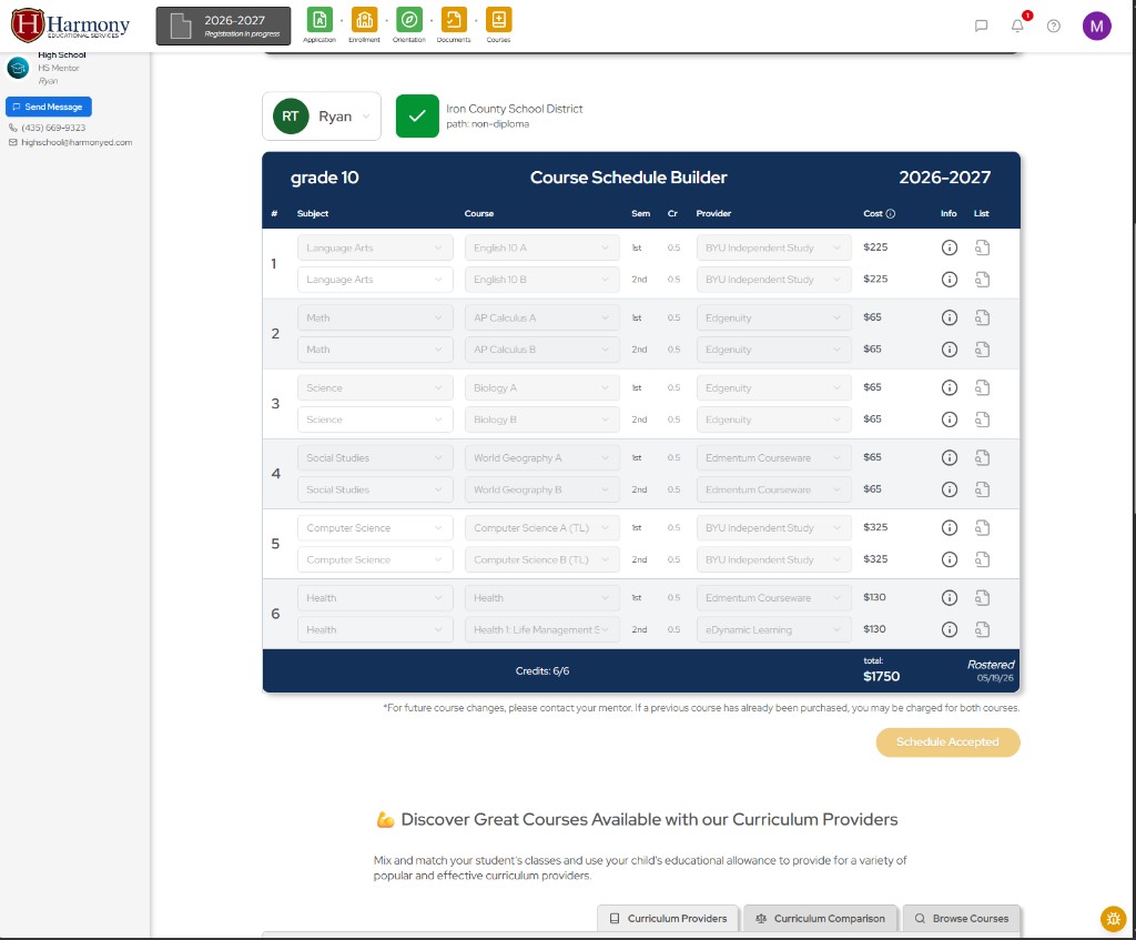
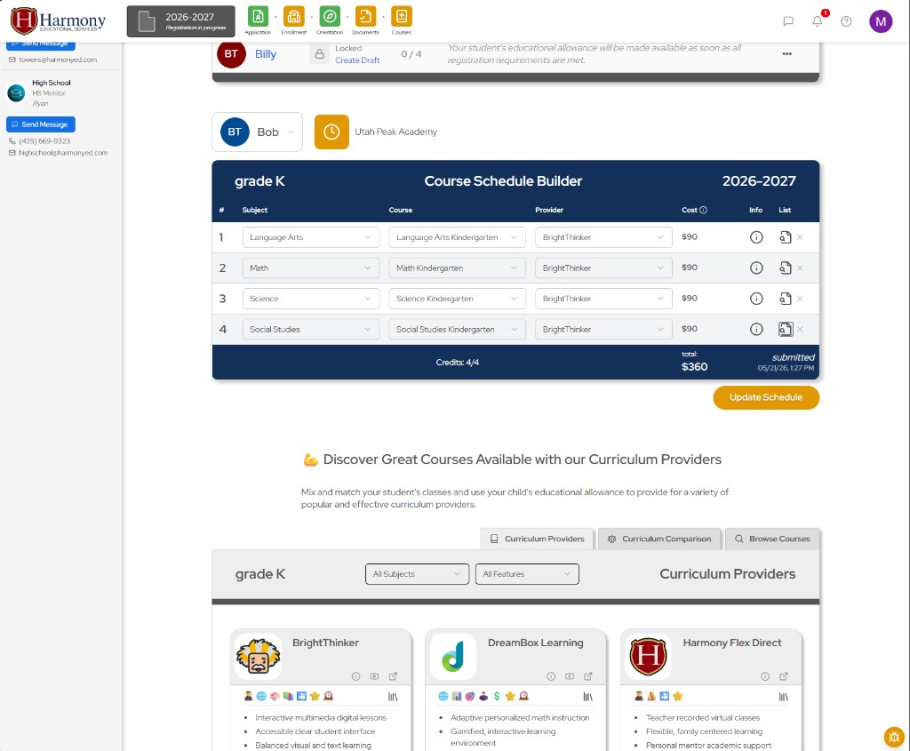
A new course schedule builder was introduced this year to help families more easily explore and select curriculum options. Families can now save draft schedules early in the enrollment journey allowing new families the ability to better connect and commit to harmony. Courses can be selected either through guided subject → course → platform flows or through searchable course lists, which is especially helpful for high school electives with a large number of available options.
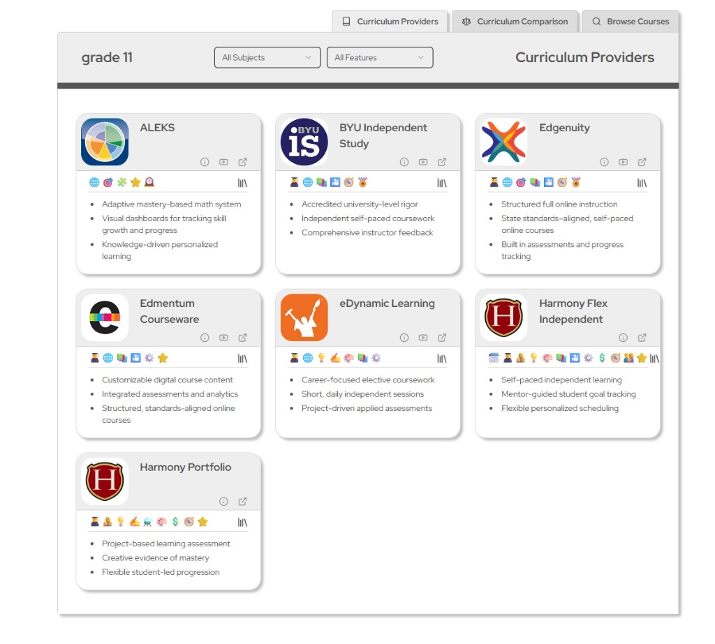
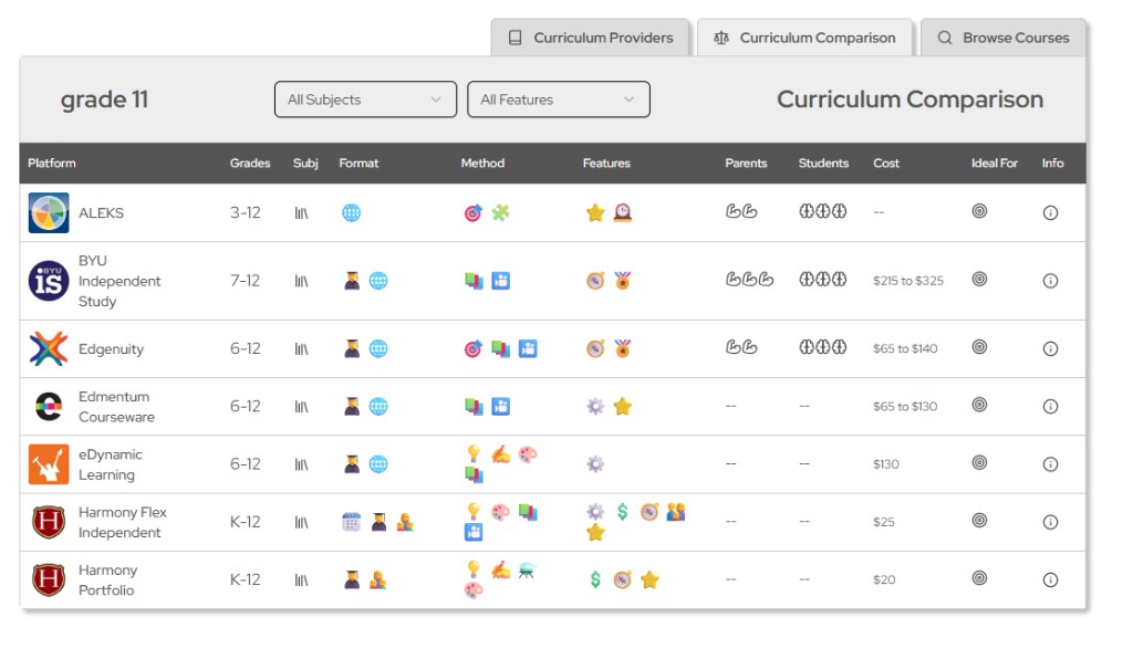
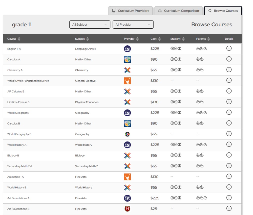
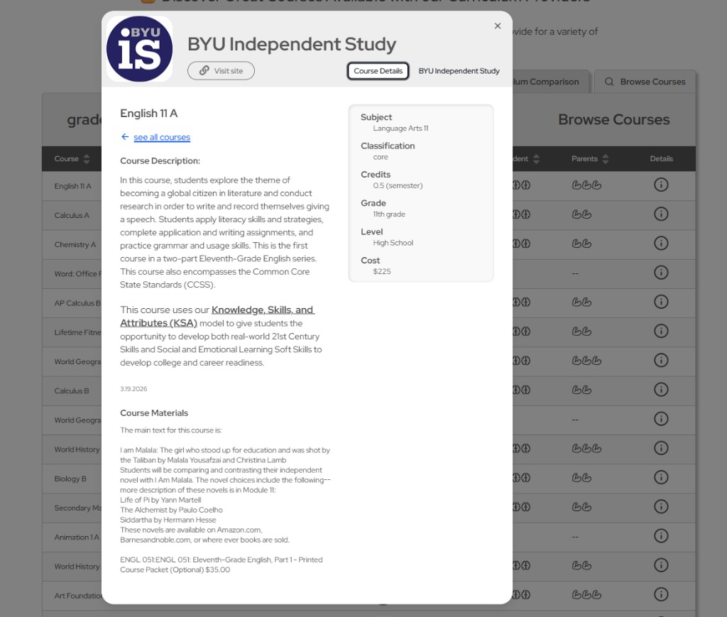
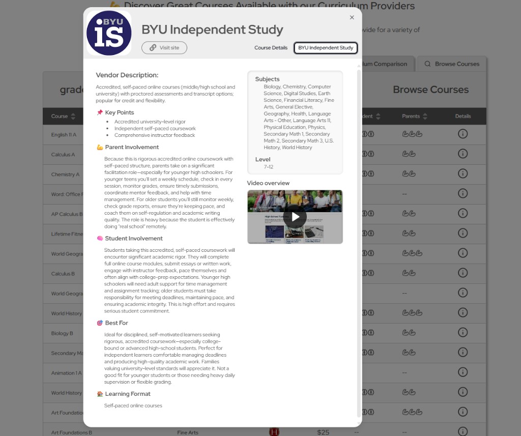
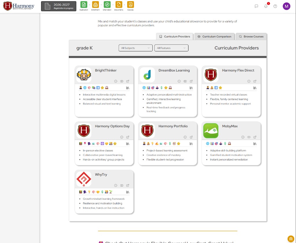
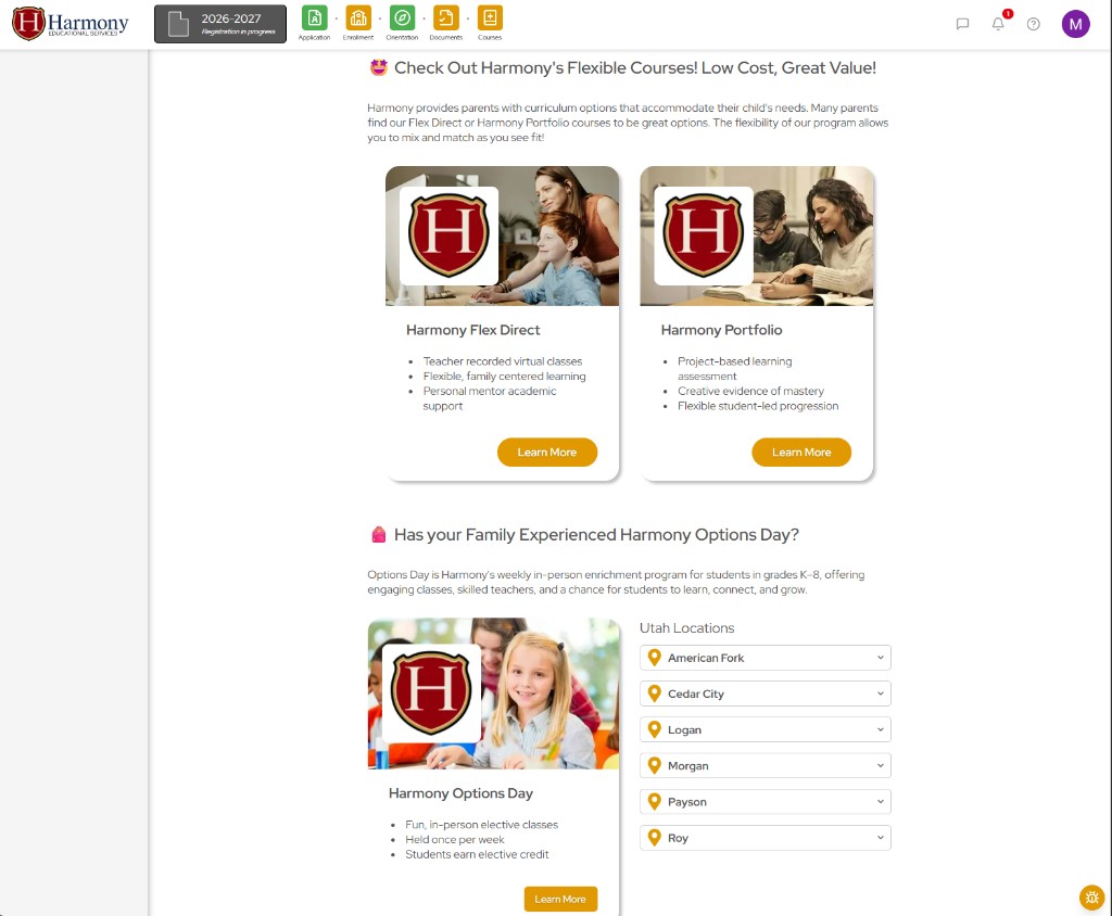
parents can browse and compare curriculum providers, flexible course options, and vendor offerings directly within the dashboard. filtering by grade level, subject, and features helps families mix and match providers while making more informed decisions about how to use their educational allowance. This is a nice enhancement as parents in previous years were dependent on mentors to make informed decisions and now can more easily shop autonomously. vendors and courses display based on those available to the specific student (school and grade)
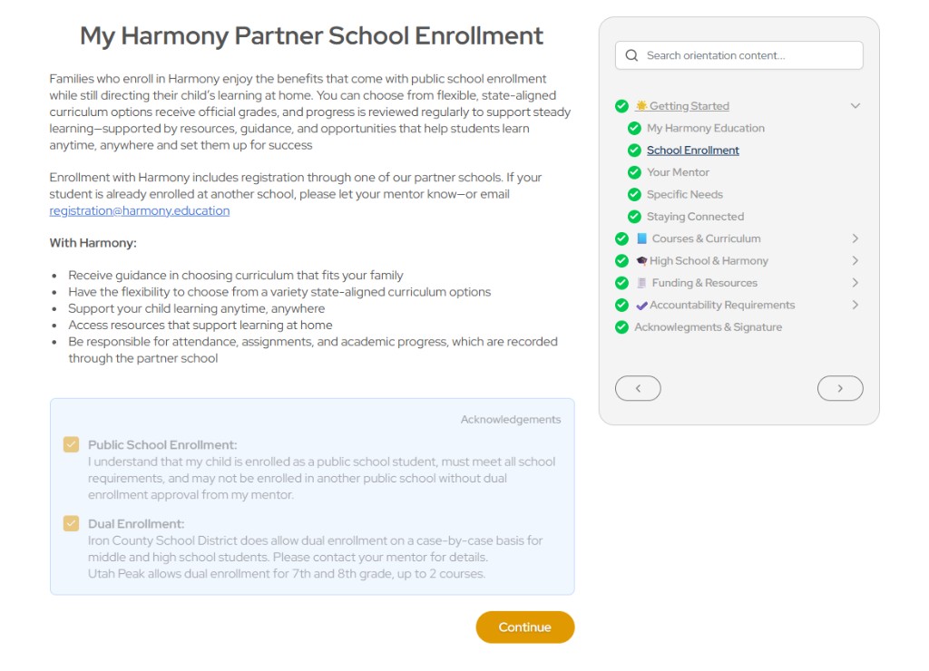
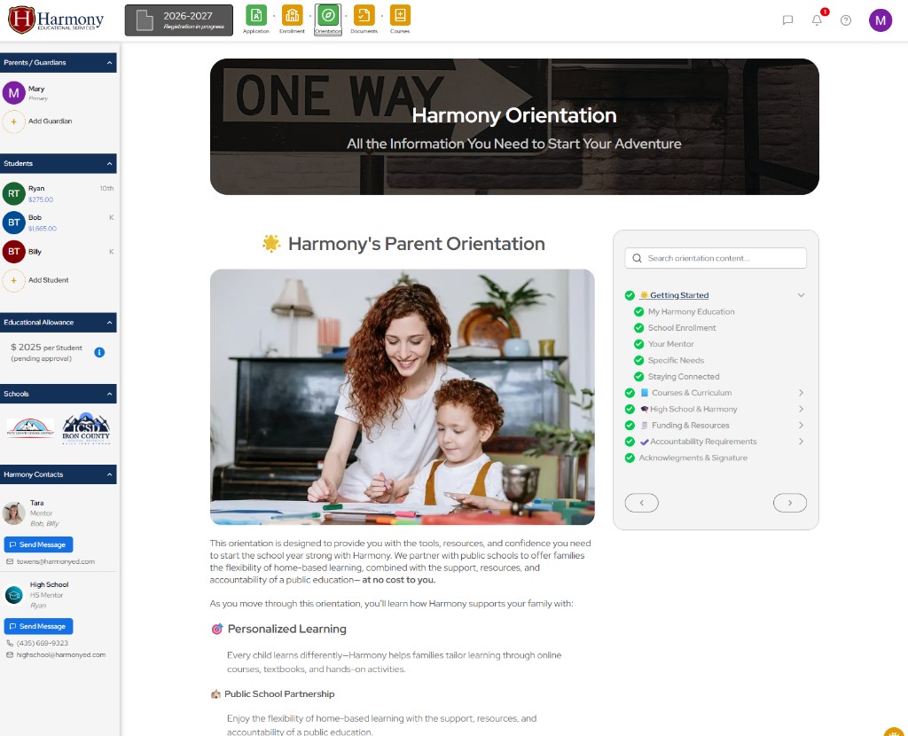
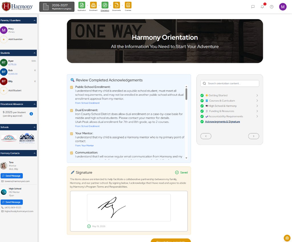
the orientation experience was redesigned as a dynamic, guided flow with searchable modules, progress tracking, contextual FAQs, acknowledgments, and digital signature capture. The previous website required separate locations for these and the orientation was divided into several orientations cluttered with irrelevant details. Adding the acknowledgements along side of the relevant slides helps parents better understand the context for these and ensures they understand and agree to them. adding the a this gives parents a clearer understanding of what they need in one place in order to have a successful year. The orientation becomes a searchable library after it has been complete for parents to easily reference, saving mentor time.
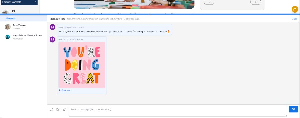
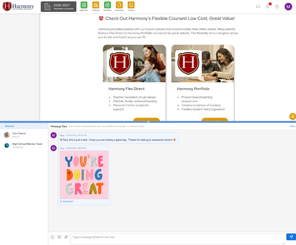
Integrated mentor messaging allows parents to communicate directly with assigned mentors from within the family dashboard experience. Conversations, attachments, and contact context are accessible alongside enrollment and student workflows, reducing reliance on external email and making support more immediate and connected throughout the school year. Automatic email notifications alert recipients when new messages are received, helping ensure timely communication.
The system also improves internal visibility and oversight by allowing account managers to more easily review, curate, and support mentor communication as part of training and quality assurance efforts. The messaging experience supports images, file attachments, emojis, and threaded conversations, creating a more modern and user-friendly communication system for both families and staff.
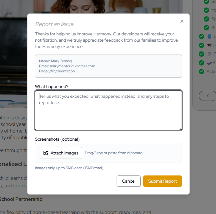
an in-app bug reporting flow allows parents and internal users to flag issues directly from the platform experience. this creates a faster feedback loop during iterative development, helping the team identify usability problems, broken workflows, and edge cases earlier in the release cycle. an email gets sent to the developer directly with helpful metadata. users can include screenshots with an easy drag and drop, or paste from clipboard.
employee dashboard - serving harmony
iterative ux development
parallel to the family dashboard, the employee experience was developed through ongoing iterative ux work in close collaboration with key staff members across the organization. the redesign focused heavily on reducing operational friction, simplifying workflows, and consolidating fragmented internal systems into a more unified operational platform. through continuous feedback and iteration, the dashboards evolved into highly practical workspaces tailored around the real responsibilities and daily behaviors of employees.
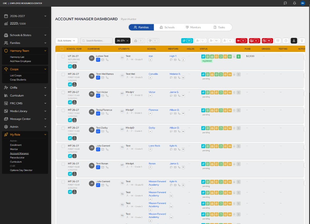
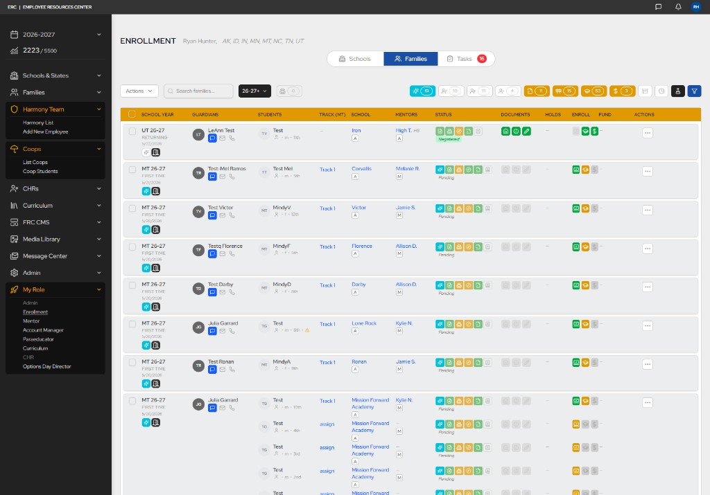
the new role-based dashboards became one of the most impactful improvements within the platform. these dashboards were designed to surface critical information at a glance while providing fast access to the actions employees perform most frequently. staff can quickly drill into detailed family and student information, while filters, count indicators, and workflow groupings help organize workloads and provide clearer operational direction. by reducing unnecessary navigation and surfacing the most important actions more prominently, the system significantly improved clarity, efficiency, and day-to-day usability.
automation systems such as automatic school placement and mentor assignment further reduced administrative workload and eliminated onboarding delays that previously required extensive manual coordination. improvements to data structure, reporting, and operational visibility also provided leadership with greater insight into retention, finances, employee workload, and organizational performance. the result was a more scalable, maintainable, and human-centered operational environment that improved usability, efficiency, and visibility across the organization.
*only testing family data was used in these screenshots. views with sensitive data are excluded.
featured improvements:
role-based dashboards became the primary workspace for employees, surfacing the families, tasks, and actions most relevant to each position. account managers and enrollment staff see tailored views with filters, count indicators, and workflow groupings that organize workloads and clarify next steps without unnecessary navigation.
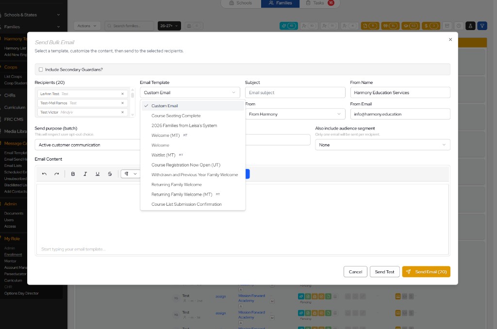
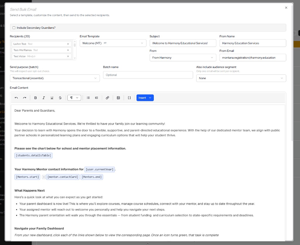
a custom email templating system allows staff to send bulk communications using reusable templates with dynamic placeholders for student details, mentors, school year, and other contextual data. employees can select templates, customize content, and send to filtered recipient groups while respecting opt-out preferences and batch purpose settings.
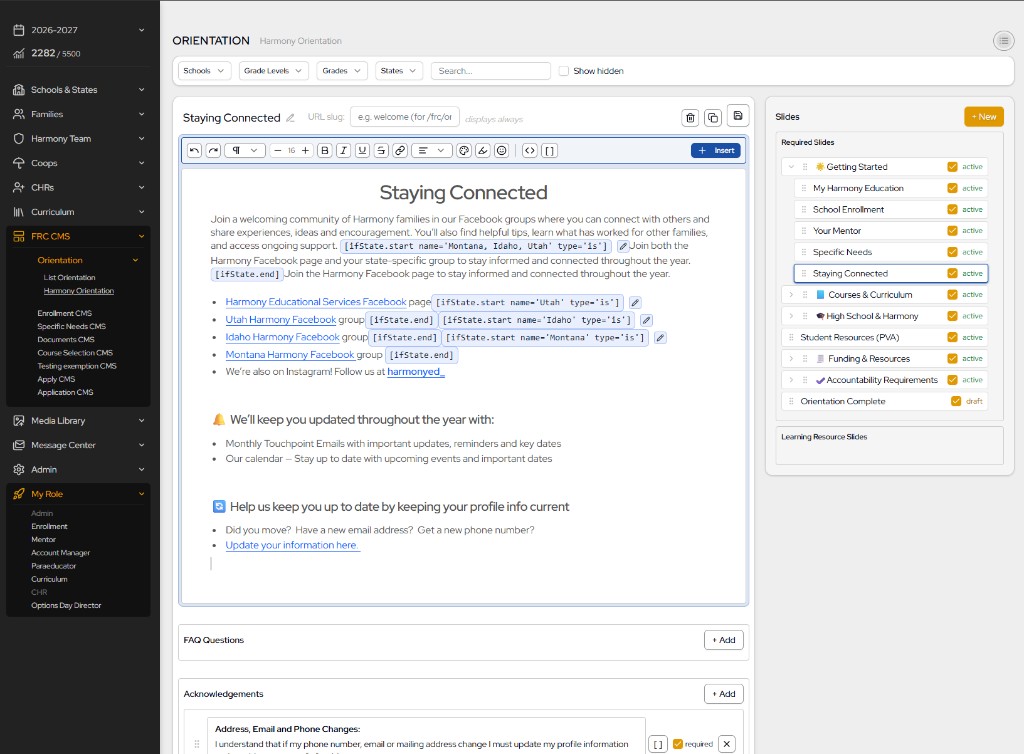
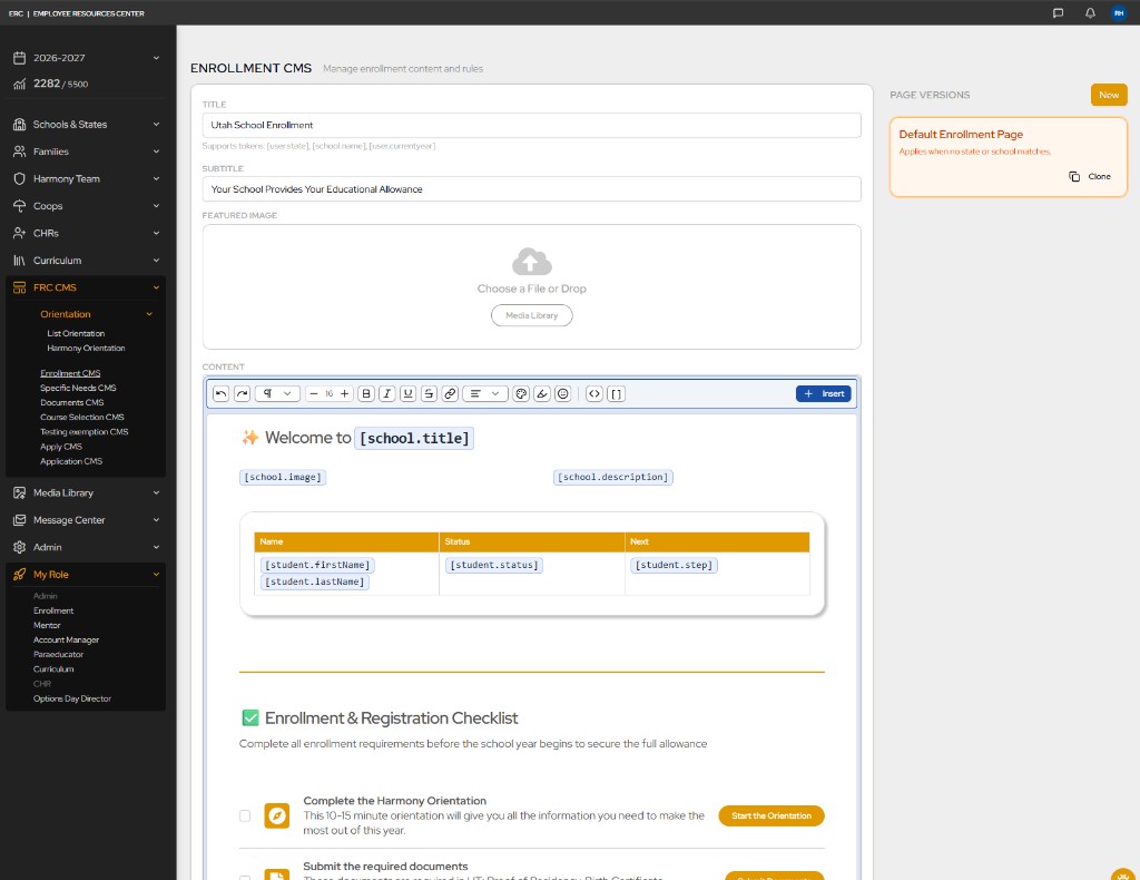
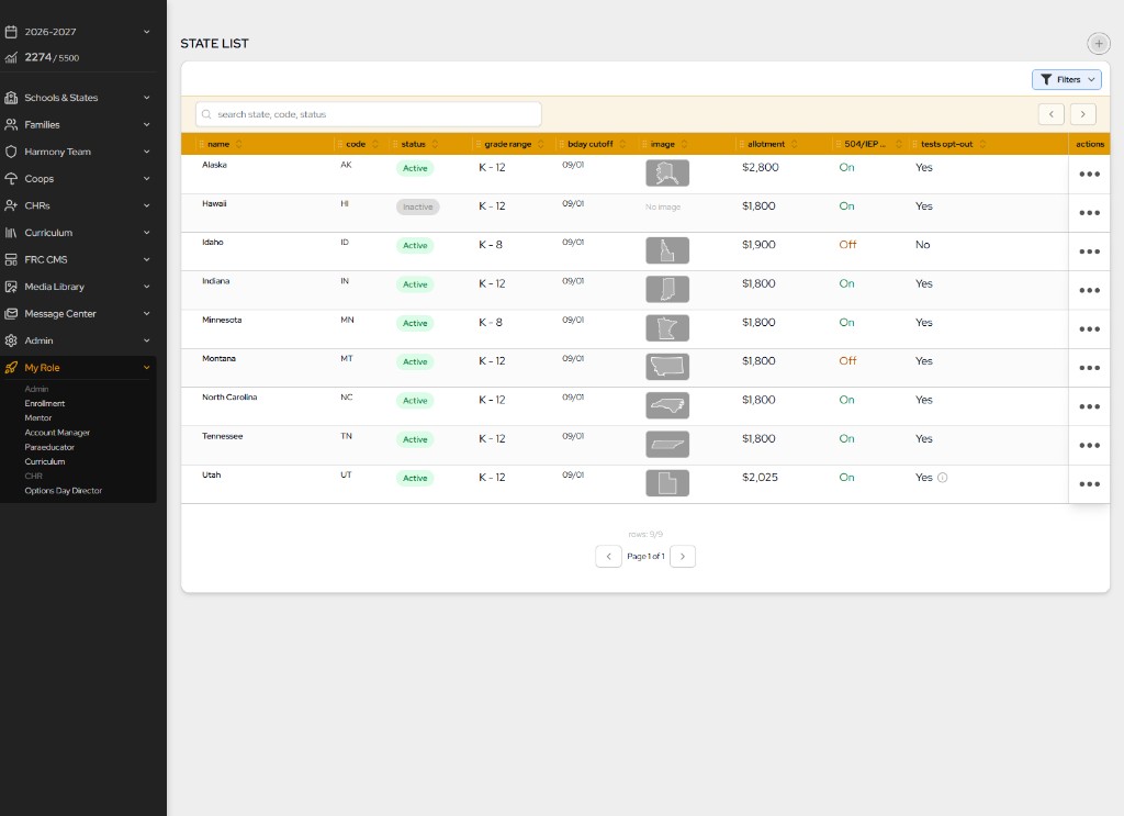
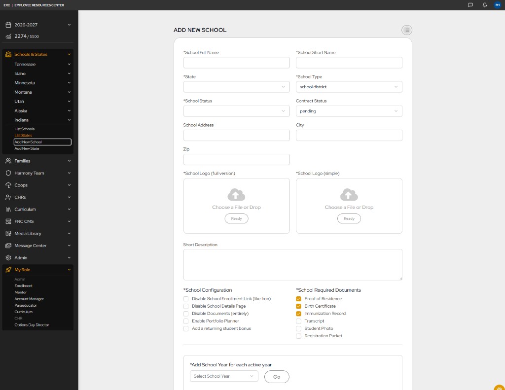
administrative content and configuration are managed through reusable CMS-style interfaces for states, schools, and organizational settings. staff can configure grade ranges, allotments, required documents, and school-specific options from centralized admin screens. leveraging a lexical editor with custom blocks makes it a cinch to edit.
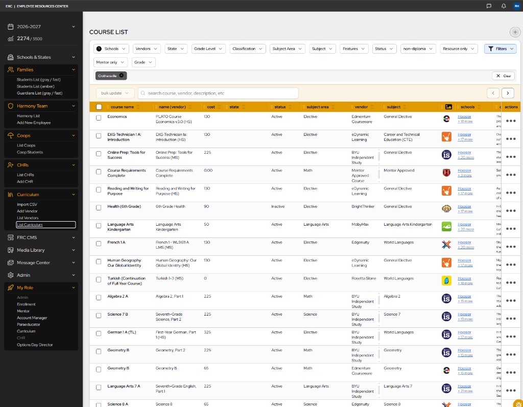
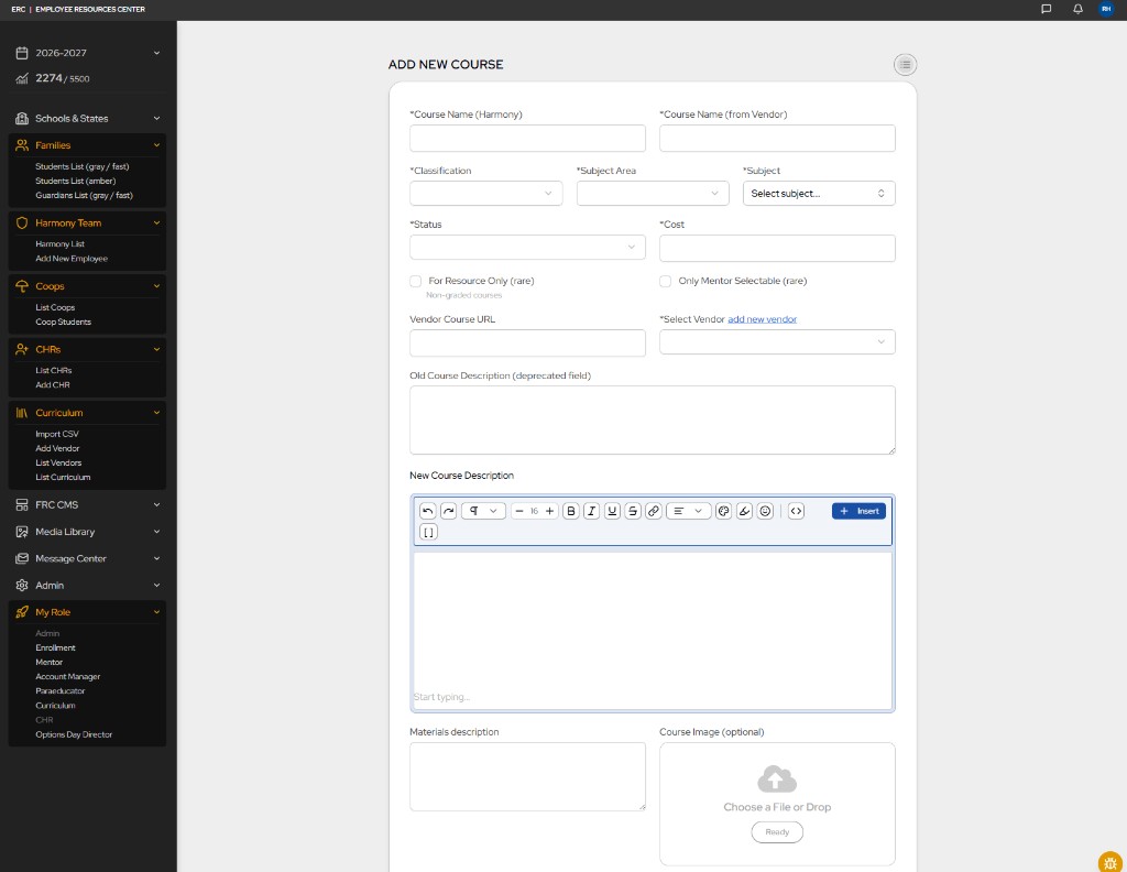
the curriculum team manages courses and vendors through filterable admin tables and structured add/edit forms. courses can be linked to vendors, schools, subjects, and grade levels with rich descriptions, materials, and cost data—replacing fragmented curriculum tracking with a single operational source of truth.
structured student, family, and financial data is now presented through powerful administrative views featuring advanced filtering, status indicators, enrollment metrics, and operational reporting. these interfaces provide leadership and operational teams with significantly greater visibility into retention, workload, compliance, financial activity, and overall organizational performance. new lead-source tracking and student tagging systems were also introduced, allowing management to better understand enrollment trends and marketing effectiveness. combined with flexible filtering and reporting capabilities, these improvements transform data into actionable insights that support faster decision-making, stronger operational oversight, and more informed strategic planning.
ai & rapid agentic development
iterative ux development
as development progressed, and despite a productive design and prototyping phase, the project faced a significant time crunch. with the upcoming school year rapidly approaching, there was a limited window to launch the new family application and dashboard before enrollment season began. the scope of the rebuild had grown so large that traditional development alone was unlikely to meet the deadline. the emergence of modern ai tools and agentic development workflows became a turning point, helping transform a project that was months behind schedule into one that could successfully launch on time.
rather than replacing human expertise, ai became a force multiplier. a deep understanding of user needs, close collaboration with employees, and strong ownership of the product vision allowed ai tools to be directed toward meaningful outcomes. prototyping, code generation, debugging, refactoring, research, documentation, and systems planning all accelerated dramatically. because the platform was built on a modern technology stack, ai integrated naturally into development workflows and became increasingly effective as the system matured.
the greatest value came from combining human-centered ux thinking with agentic development workflows. by staying closely connected to users, continuously gathering feedback, and rapidly iterating on solutions, ideas could move from concept to production at a pace that would have been difficult to achieve through traditional development methods alone. the result was not simply faster software development, but a more responsive product process capable of delivering substantially more value in significantly less time.
AI Role & Project Impact
primarily for development i have used cursor with composer. There are a few significant ways it has helped in the ambitious lift of this project.
- accelerated feature delivery
- reduced development bottlenecks
- faster prototyping and iteration
- improved code quality and consistency
- faster onboarding into unfamiliar technologies
- reduced time spent on repetitive development tasks
- enabled rapid experimentation and validation
- supported complex architecture and systems planning
- allowed more time to focus on users, product strategy, and organizational needs
- increased overall value delivered without increasing team size
outcomes & impact
The rebuild transformed Harmony from a fragmented legacy platform into a unified, scalable system—launched in time for enrollment season despite an ambitious scope.
for families
- The enrollment process consolidated from 60+ pages into six pages
- A centralized dashboard for registration, documents, orientation, course selection, and messaging
- Course schedule builder, vendor comparison, and curriculum discovery with less mentor dependency
- Dynamic orientation with searchable modules, acknowledgements, and digital signatures
- Integrated mentor messaging and in-app issue reporting for faster support
- Early enrollment feedback has been positive, with reported issues identified and resolved quickly
for employees & operations
- Role-based dashboards for account managers, enrollment, and other operational staff
- Fragmented tools consolidated into a unified Employee Resource Center
- Custom CMS for orientation and enrollment content with tokens and conditional logic
- Bulk email templating with dynamic placeholders and delivery tracking
- Centralized course, vendor, school, and state administration
- Student and financial metrics with filtering, tagging, and lead-source tracking
- Automation for school placement and mentor assignment reduced manual coordination
for the platform
- Modern stack: TypeScript, Next.js, PostgreSQL, Drizzle, Auth.js, and Vercel
- Structured data models connecting families, students, schools, curriculum, and finances
- Public marketing and authenticated dashboards unified in one framework
- Permission-based access across sensitive student, family, and employee data
- Architecture built to scale across states, schools, grade levels, and roles
for the business
- Platform launched on time and the transition has gone smoothly
- Addressed the platform and UX issues driving the majority of parent frustration
- Reduced operational friction and employee labor previously spent compensating for broken workflows
- Clearer brand, marketing foundation, and family enrollment journey
- Leadership gained visibility into retention, finances, workload, and marketing effectiveness
- Stronger base for future growth, analytics, automation, and continued iteration